Hallvarsson & Halvarsson
The agency's own website, where small movements and details make the site easy to use
Hallvarsson & Halvarsson's own website was made together with two different art directors. The design came from them, and I turned it into a working interface. Much of the work went into the details that decide how the site feels to use.
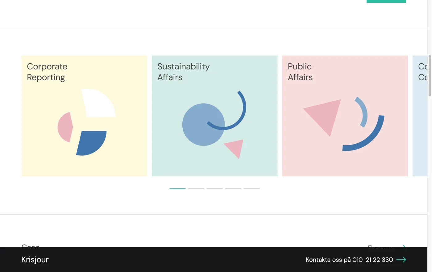
- Sliders that behave. The number of cards adapts to the screen, from one on a phone to four on a large screen. You can browse with the mouse, keyboard, swipe or scroll wheel, and when you reach the last card the page keeps scrolling instead of getting stuck. Some sliders run out to the right edge of the screen, so you can see there is more.
- A menu that slides in. The menu slides in from the right, over the page, which is dimmed.
- The button stays put. The hamburger changes into a cross and stays on top of the menu instead of disappearing under it. The same button opens and closes, in the same place.
- Animations on hover. The animations were made by the design side, and I built the interaction that starts and stops them when the pointer moves over them.
The site is built on our Dbase platform.
halvarsson.seThe site, live (opens in new tab)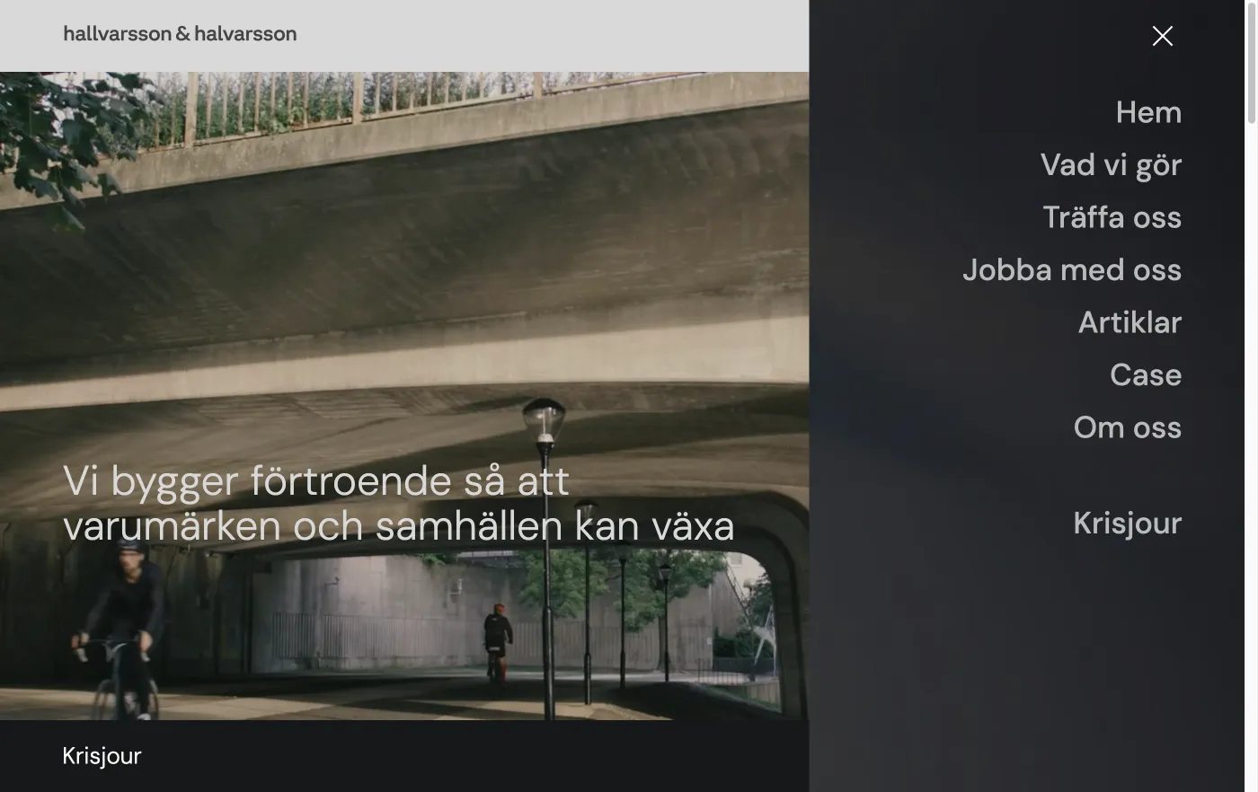
- WordPress
- PHP
- JavaScript
- Swiper
- Lottie
- Dbase platform